Forms and Inputs

User Input and Data Collection

Forms are how we collect data from users. They are ubiquitous on the web; we encounter forms everyday on most websites we visit. Login, job search, and creating a new email, are all forms.

Forms always have a point - they capture something. Well designed forms allow for a more efficient capture of that something, and as forms can be as simple as a two field login form, to a hundred field survey, applicant intake, or application form.

It is important to remember that as a form designer, we must guide our users through our form, so that they can quickly, and most importantly (to us and our clients), accurately.

If a form leaves a user asking questions, relies on color only for required fields, does not allow for assistive technologies, and is not mobile first, users of that form might trust the company that authored the form a little less.

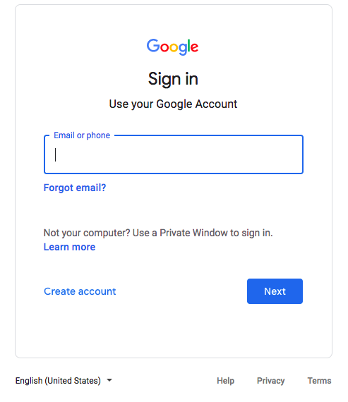
This sign in form is asking for login name. The form guides the user to the Next button which is highlighted in a solid color. The secondary option is to create an account, with other options avaliable to the user, such as privacy, designed to seem less important or required.


See: WC3 - Forms

Base HTML [+bootstrap]

<form> <div class="form-group"> <label for="Email">Email address</label> <input type="email" class="form-control" id="Email" placeholder="Email"> </div> <div class="form-group"> <label for="Passworkd">Password</label> <input type="password" class="form-control" id="Password" placeholder="Password"> </div> <button class="btn btn-default">Cancel</button> <button class="btn btn-primary">Submit</button> </form

Usage and Ideas

Button

<input type="button">
Button Style

Checkbox

<input type="checkbox">
Checkbox Style

Color

<input type="color">

Date

<input type="date">

Datetime Local

<input type="datetime-local">

Email

<input type="email">

File

<input type="file">

Hidden

<input type="hidden">

Image

<input type="image">

Month

<input type="month">

Number

<input type="number">

Password

<input type="password">

Radio

<input type="radio">

Radio and CSS

Range

<input type="range">

Reset

<input type="reset">

Search

<input type="search">

Submit

<input type="submit">

Tel

<input type="tel">

Text

<input type="text">

Text Area

<input type="text">

Time

<input type="time">

URL

<input type="url">

Week

<input type="week">

In Action

Align labels above inputs for easier form flow.

This simple login form in Bootstrap using with the labels stacked above their inputs and with placeholders. Placeholders are the text within the input and they assist a user with data entry. Placeholders should be used with labels; when a user begins typing in an input, the placeholder disappears. Google positions a label on the input's border via CSS.

Required fields can have color to indicate they are required however other indicators are needed, especially for accessibility. Consider using aria_required for all required fields. See the WCAG and ARIA2: Identifying a required field with the aria-required property.

Tab Order is Important

Be sure the tab order moves from top to bottom. Users need to be able to complete the form without the use of a mouse, ending with using the spacebar to submit the form.